
Things I want to do
In HTML, you can use the `-webkit-text-stroke` style to add an outline to text. (Although it has `-webkit` in its name, it apparently works in Firefox and Safari as well. I’ve confirmed it works in Firefox.)

However, its operation is questionable when actually used, so I will explain how it works and suggest alternatives.
Simple instructions for use
The basic usage is as follows:
-webkit-text-stroke: 幅 色;example:
-webkit-text-stroke: 1px red;Operation check
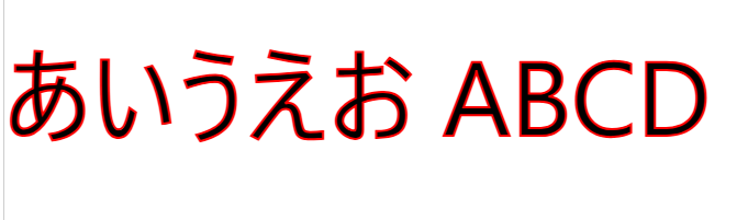
Let’s examine the behavior of the following HTML.
<p style="font-family: system-ui;font-size: 96px;-webkit-text-stroke: 2px red;"
>あいうえお ABCD</p>
Chrome(135.0.7049.115):
FireFox(138.0):

The above settings seem to display correctly in Chrome/Firefox.
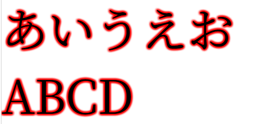
Next, let’s look at how the following HTML works. (The font has been changed from system-ui to serif.)
<p style="font-family: serif;font-size: 96px;-webkit-text-stroke: 2px red;"
>あいうえお ABCD</p>
Chrome(135.0.7049.115):

FireFox(138.0):

With these settings, it displays correctly in Firefox, but in Chrome, the borders also intersect where they should. I think this is an undesirable result for many people, including myself.
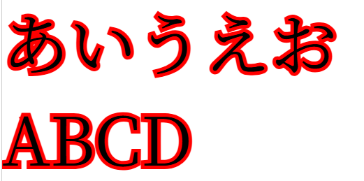
Next, let’s look at the behavior of the following HTML. (The width of the Stroke has been changed from 2 to 10.)
<p style="font-family: system-ui;font-size: 96px;-webkit-text-stroke: 10px red;"
>あいうえお ABCD</p>
Chrome(135.0.7049.115):

FireFox(138.0):

With this setting, neither Chrome nor Firefox displays black text; instead, it appears filled with the color of Stroke. (While this might have its uses), I think it’s an undesirable result for many people, including myself.
Alternative Case
As mentioned above, -webkit-text-stroke often doesn’t work as expected.
Here, we’ll display a border around the text using a different method.
Using TextShadow
Try the following code.
By repeatedly displaying a blurred Text-shadow in the same location, it creates the effect of a border.
(Reducing the number of Text-shadows will blur the border.)
<p style="font-family: serif;font-size: 96px;text-shadow: 0px 0px 5px red,0px 0px 5px red,0px 0px 5px red,0px 0px 5px red,0px 0px 5px red,0px 0px 5px red,0px 0px 5px red,0px 0px 5px red,0px 0px 5px red;"
>あいうえお ABCD</p>
Chrome(135.0.7049.115):
FireFox(138.0):

With these settings, both Chrome and Firefox displayed the content as expected.
Using TextShadow
Try the following code.
By displaying a non-blurred Text-shadow multiple times with slight shifts, it creates the effect of a border.
<p style="font-family: serif;font-size: 96px;text-shadow: 0px 0px red,1px 0px red,0px 1px red;1px 1px red"
>あいうえお ABCD</p>
Chrome(135.0.7049.115):

FireFox(138.0):

I managed to do it.
However, as mentioned above, if the text is large, the border is almost invisible.
(You could probably make it look more realistic by drawing multiple images with a slight offset, but that wouldn’t be practical without writing a script.)
If the text is small, it will be displayed as shown below, which is not a problem.

-webkit-text-stroke and fixed display position
Try the following code.
The `-webkit-text-stroke` method is used to draw a string with the character body and border filled, and by writing the same string in the same position, the character body and border are drawn again.
<div style="position:relative;font-size: 96px;font-family: serif;">
  <div style="-webkit-text-stroke: 10px red">あいうえお ABCD</div>
    <div style="position:absolute;top:0px">あいうえお ABCD</div>
  <div>
Chrome(135.0.7049.115):
FireFox(138.0):

With these settings, both Chrome and Firefox displayed the content as expected.
Result
I have confirmed that -webkit-text-stroke is working correctly.
Furthermore, for settings that didn’t work as expected with -webkit-text-stroke, the alternative solution allowed me to display them in the intended style.

コメント